
The Designer’s Journal
A digital concept for a new architectural reader.
Project —
Editorial Website
Services —
Experience Design
Interface Design
Logo Design
Concept
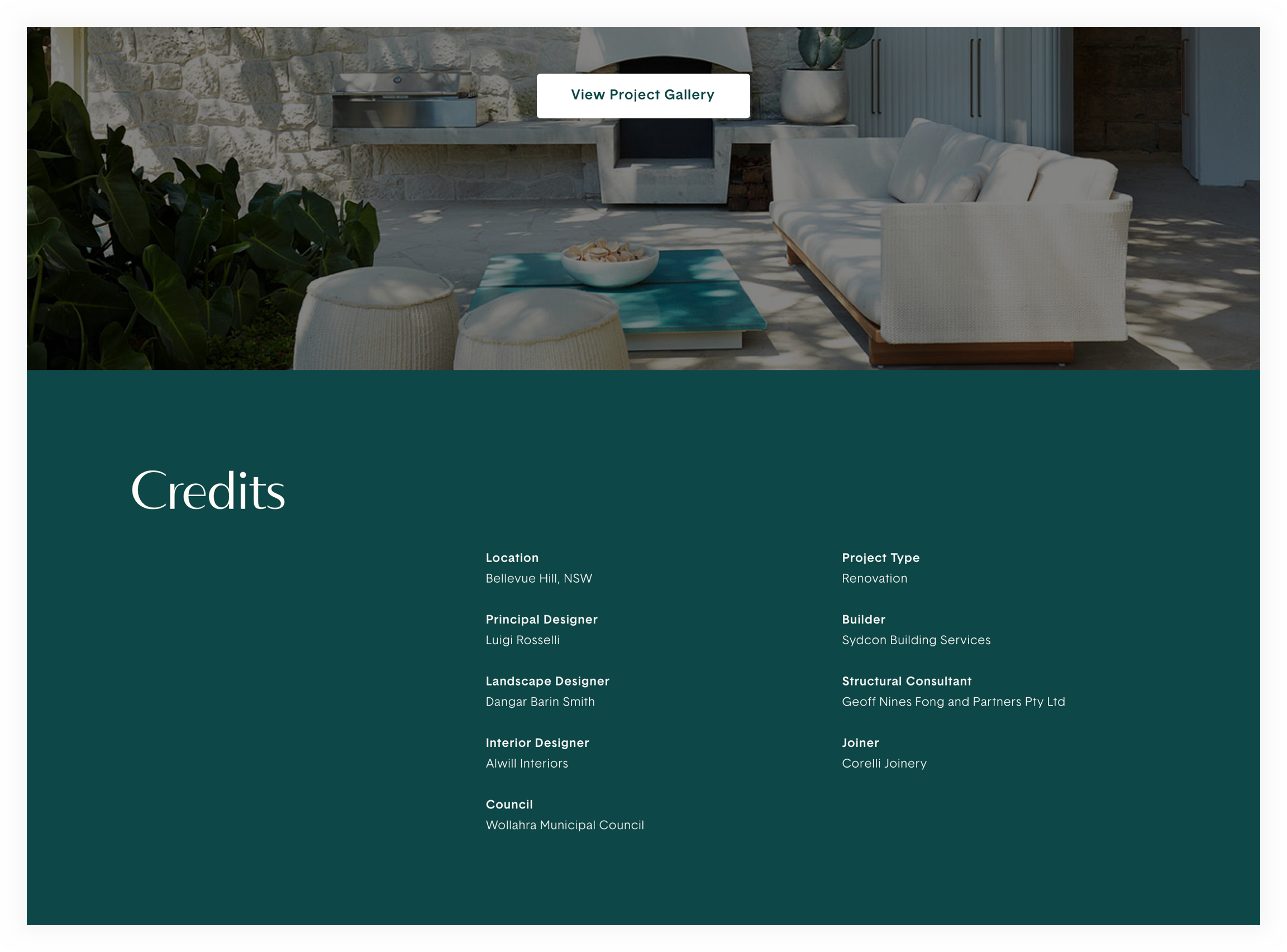
Architectural journals abound in our age. However, many of them are a purely aesthetic experience. They amplify the visuals of finished projects, but reduce the more cerebral aspects of the architect’s decisions. Even more worrying is the outright omission of credit to below-the-line contributors such as carpenters and engineers.
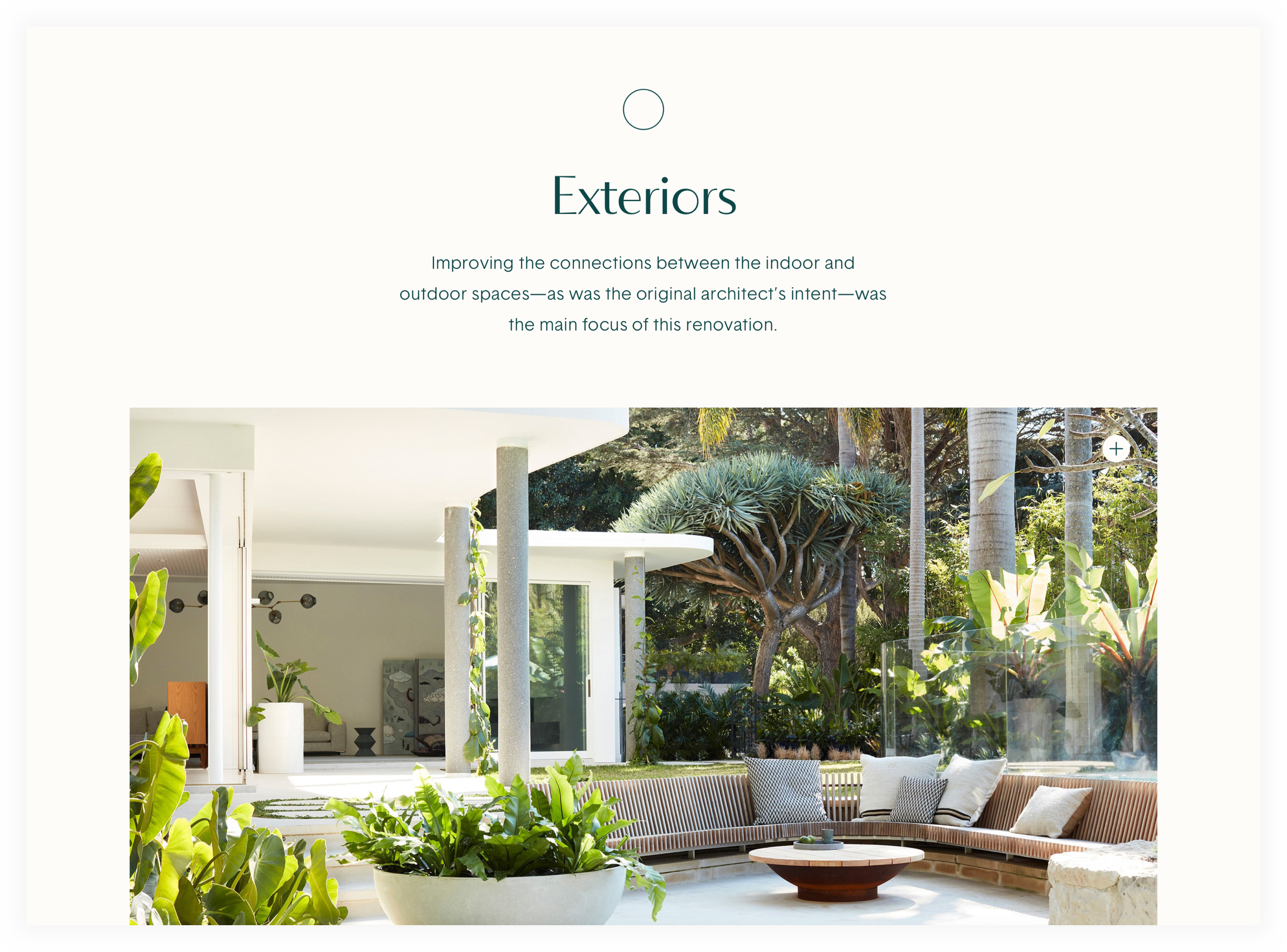
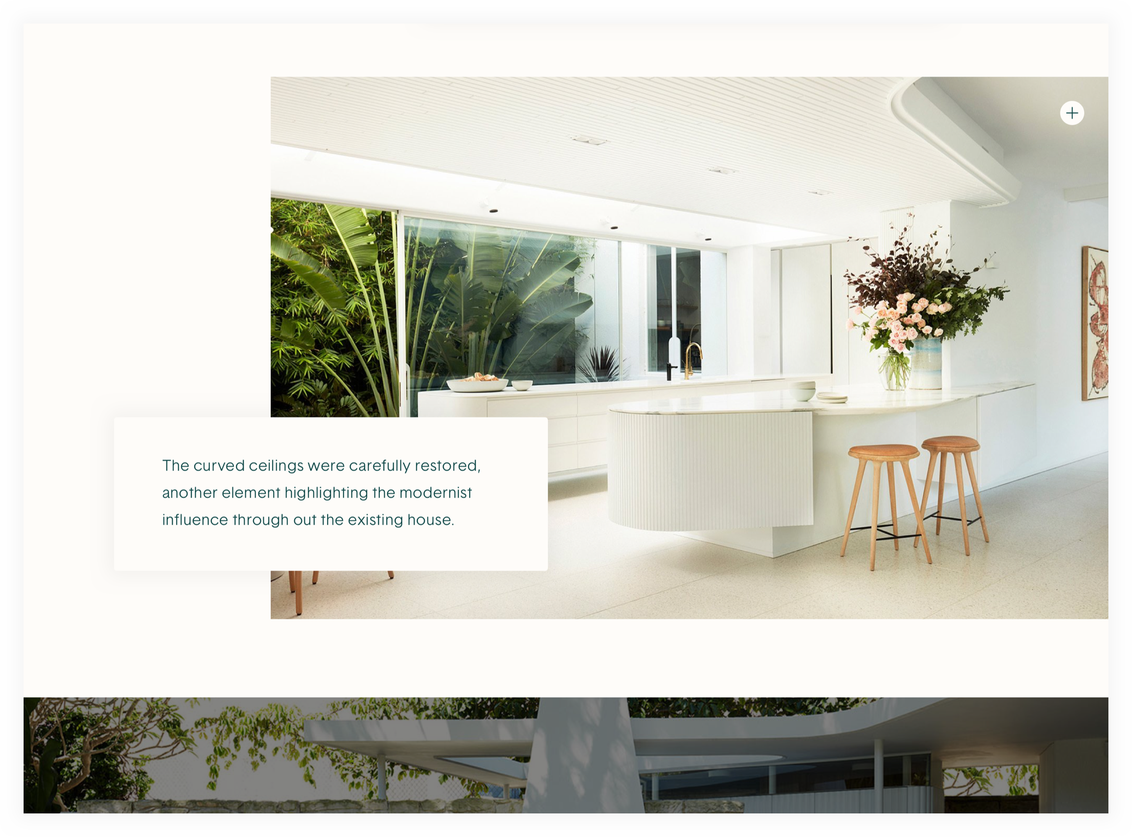
The Designer’s Journal is a concept that still elevates the visual experience of observing architecture, but dedicates more space to the rationale beyond the facade and the contributions of those beyond the principal architect.

Elevating Content
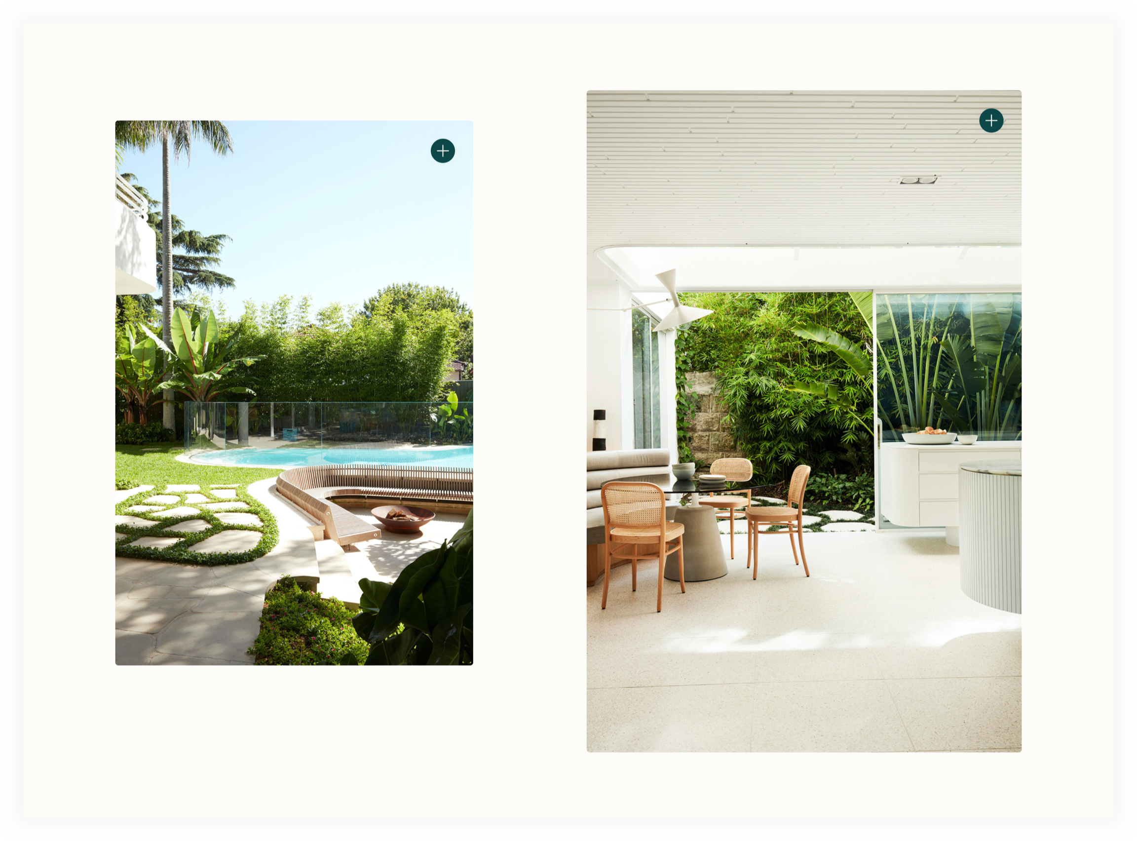
The editorial spaces were laid out to balance stunning photography with written descriptions that provide more nuance around architectural choices. Subtle shadows around text blocks and interface elements that alternate color to stay visible connect the viewer to the story without interfering.
Design Foundations
When cooking a meal, the best techniques and loftiest concepts can’t save a dish when the ingredients are poorly chosen. Design is no different.
With beautiful typefaces—Bergman from F37, and Basetica from 205TF—paired with a simple, duo-toned color palette of olive and cream, the elegant experience of The Designer’s Journal falls into place.