
Zarbee’s
A contemporary (and charming) design system.
Project —
Design System
Origins
Zarbee’s is a household name, provided you have children. But, after many years of success in this space, Zarbee’s wanted to appeal to an older audience.
This wish combined with fresh competition from digitally-native brands that were providing excellent eCommerce and editorial experiences. Zarbee’s needed to step-up, and the first step was reframing the ask for a new website into an exploration of design systems.
Accessibility-First Foundations
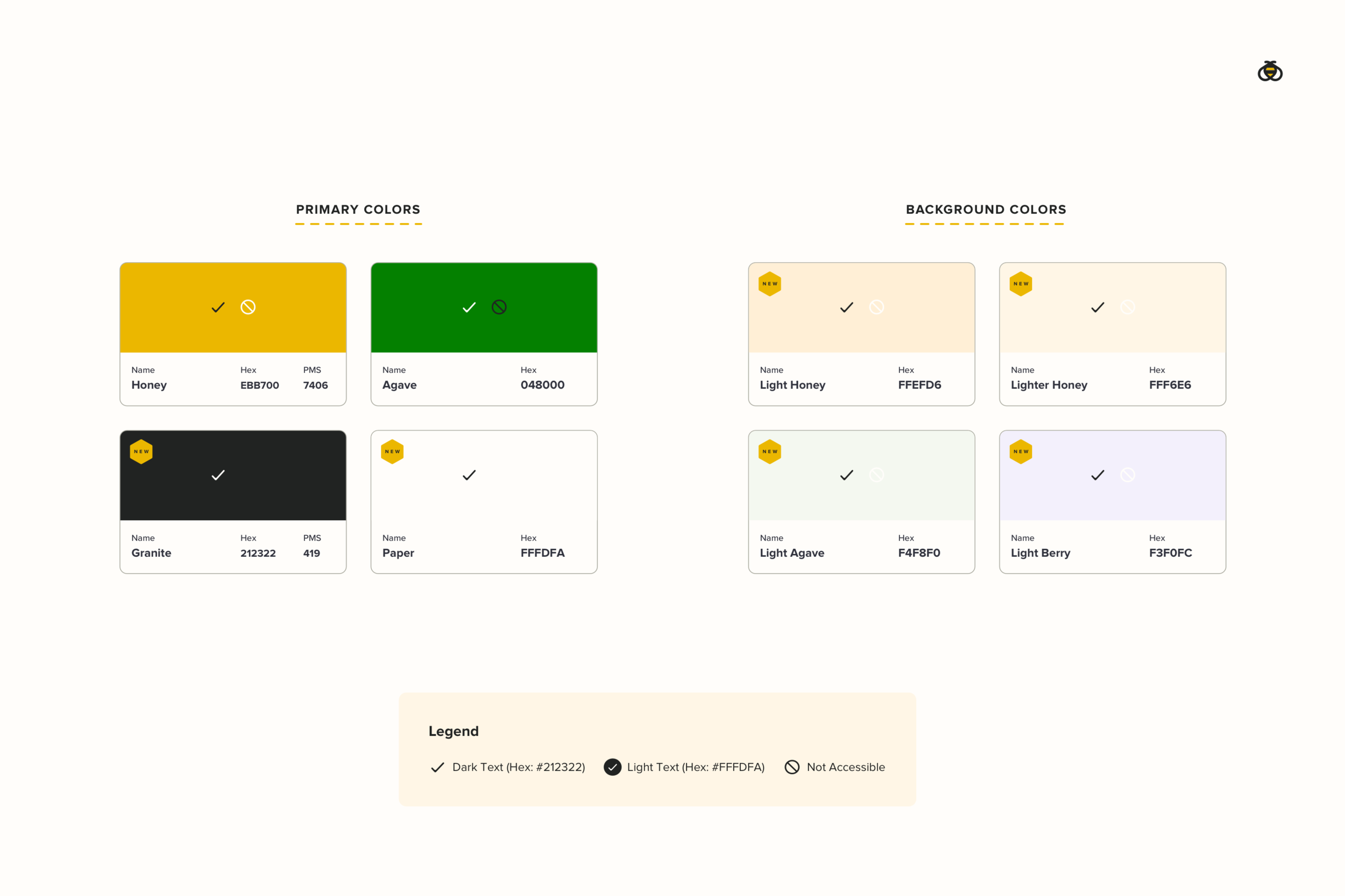
Honey is the main ingredient in many Zarbee’s products, making yellow the primary color in the brand’s visual identity. But, creating a design system around yellow would pose one accessibility issue after another. A new color palette was creating based on the existing brand standards, one which elevated old secondary colors to new primary status and included more explanation on acceptable color combinations.
Standard but Still Fun
Design systems are about standards, and best practice is layered into every bit of every decision. But, design systems must engage an audience to be truly compelling.
Thankfully, Zarbee’s brand is already full of personality. All was needed were clear spaces where best practice would live and brand personality would live. Zarbee’s new icon library is a great example.
Interactive icons adhere to color accessibility standards and are more geometric and consistent in their appearance. Graphic icons are used for decoration and contain a much more free-spirited approach to color, shape, and detail.
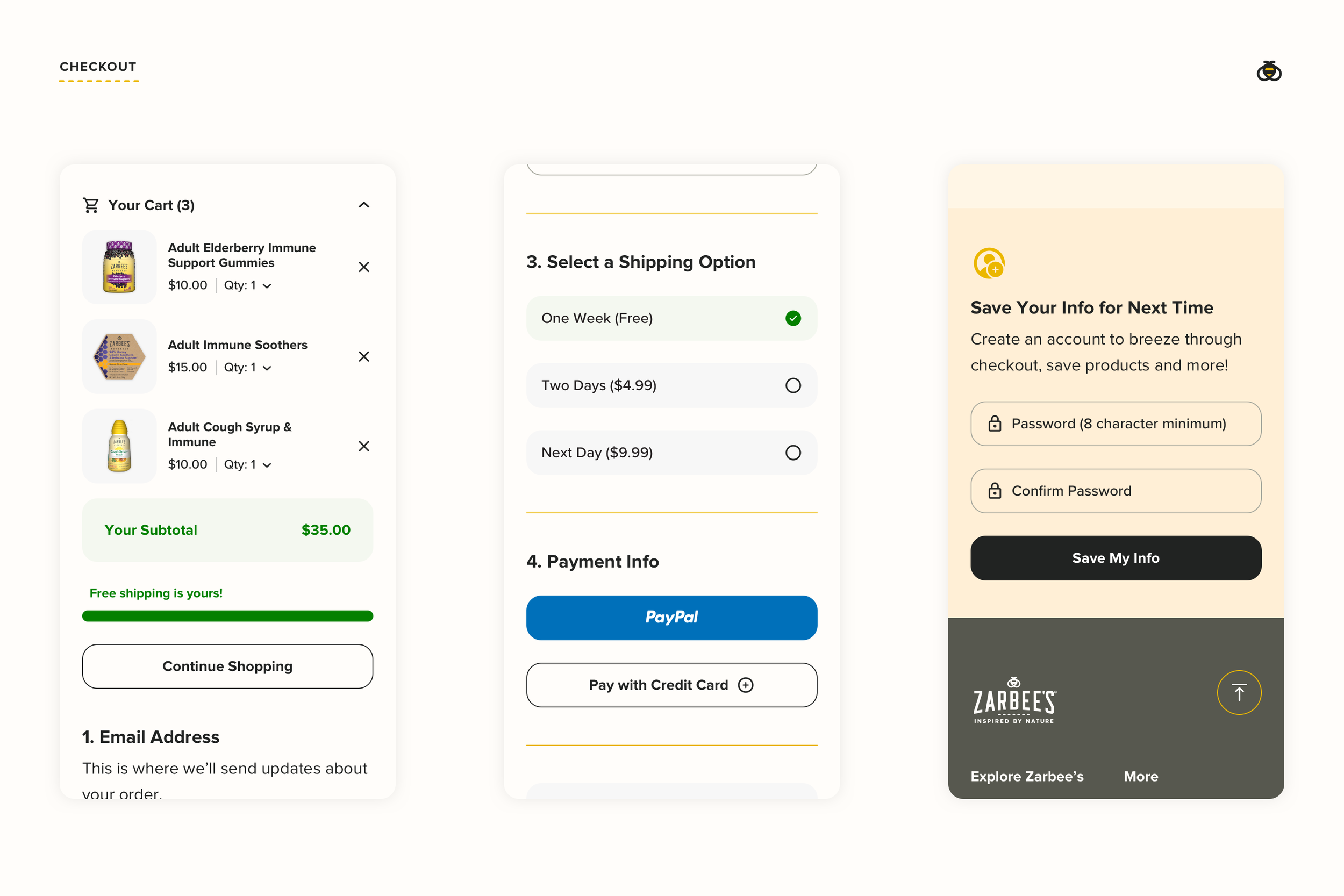
Reducing Guesswork
As the design system was built up—layer-by-layer—engineering collaborators became more important. A highly-detailed mode of communication and documentation became paramount with remote teams. Thankfully, Zarbee’s design system was built with DNA of a series of simple, repeating patterns that were all documented in an approachable manner.
The What & The Why
Designers can—at times—believe that we will be the only ones ever to touch the work we are doing. Customer-centric brands can’t work within those confines, because the work of meeting customer needs is never finished. Design must be done with the knowledge that others will soon join the journey.
More important than any artifact that was created for Zarbee’s Design System, is the the explanation “why” behind every decision. It’s all plainly spoken and paired with visual aids so it’s accessible to those who will pick up the mantle for the brand in the future.
A sample of Zarbee’s Design Tenets
Bringing it All Together
With design system foundations well-laid, melding components into experiences was rather straightforward. Much of the guesswork around styling, spacing, typography and color was established. Now, the focus could shift to new ideas, like saving content to an account, creating a new editorial space, and expanding into e-commerce.